
Clothing Shop – Tbuy
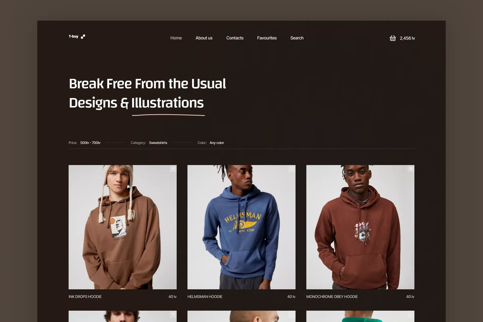
This is a concept for an online store features a unique collection of clothing with original art from independent artists and exclusive designs in collaboration with famous brands. The user interface is designed for ease of use, with intuitive navigation, clear product images, and detailed descriptions. It will also offer a personalized shopping experience with […]
ForumPress – Web design
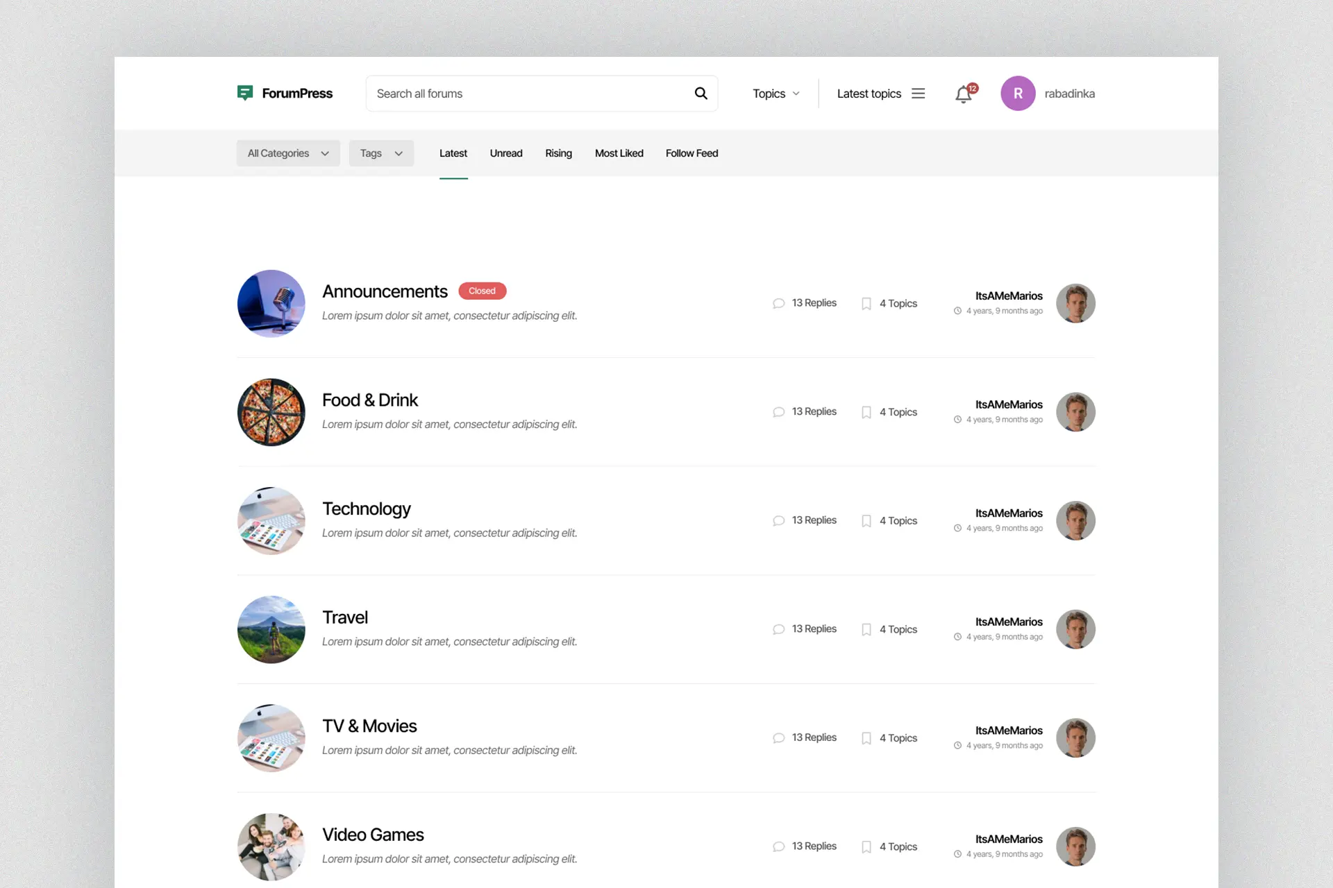
This forum website features a simple and clean user interface with light colors that provide a modern and inviting feel. The design is easy on the eyes and promotes a relaxed and welcoming environment for users to engage in discussions and connect with others. Project file
MicSkill – Media Platform
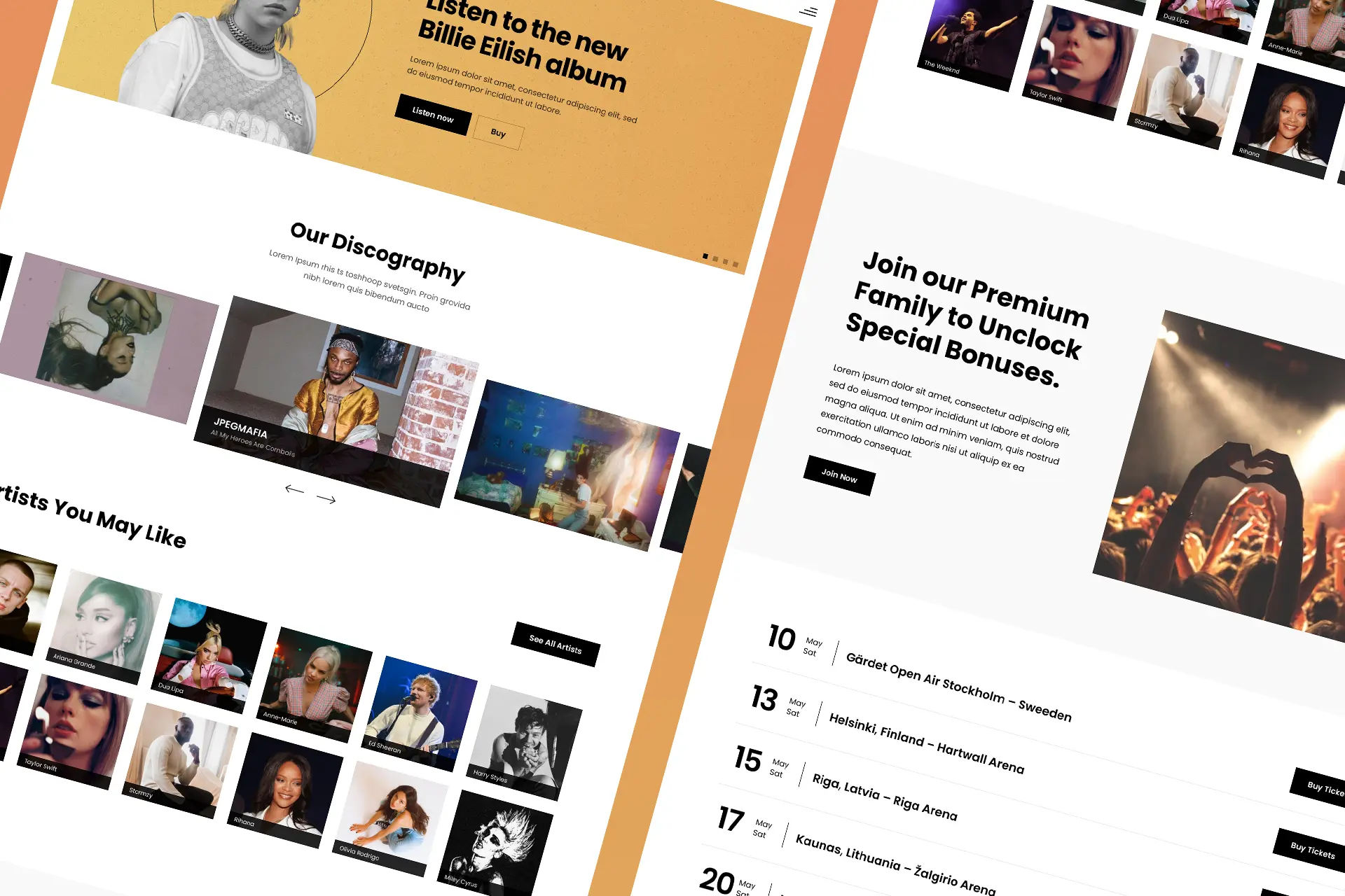
This online media website provides a comprehensive platform for music lovers to explore the discography of their favorite artists, discover new music, and stay up-to-date on the latest events. The user interface is intuitive and easy to navigate, with artist information and tour dates readily accessible. The website also features a sleek and modern design, […]
Mogger – Blog Platform
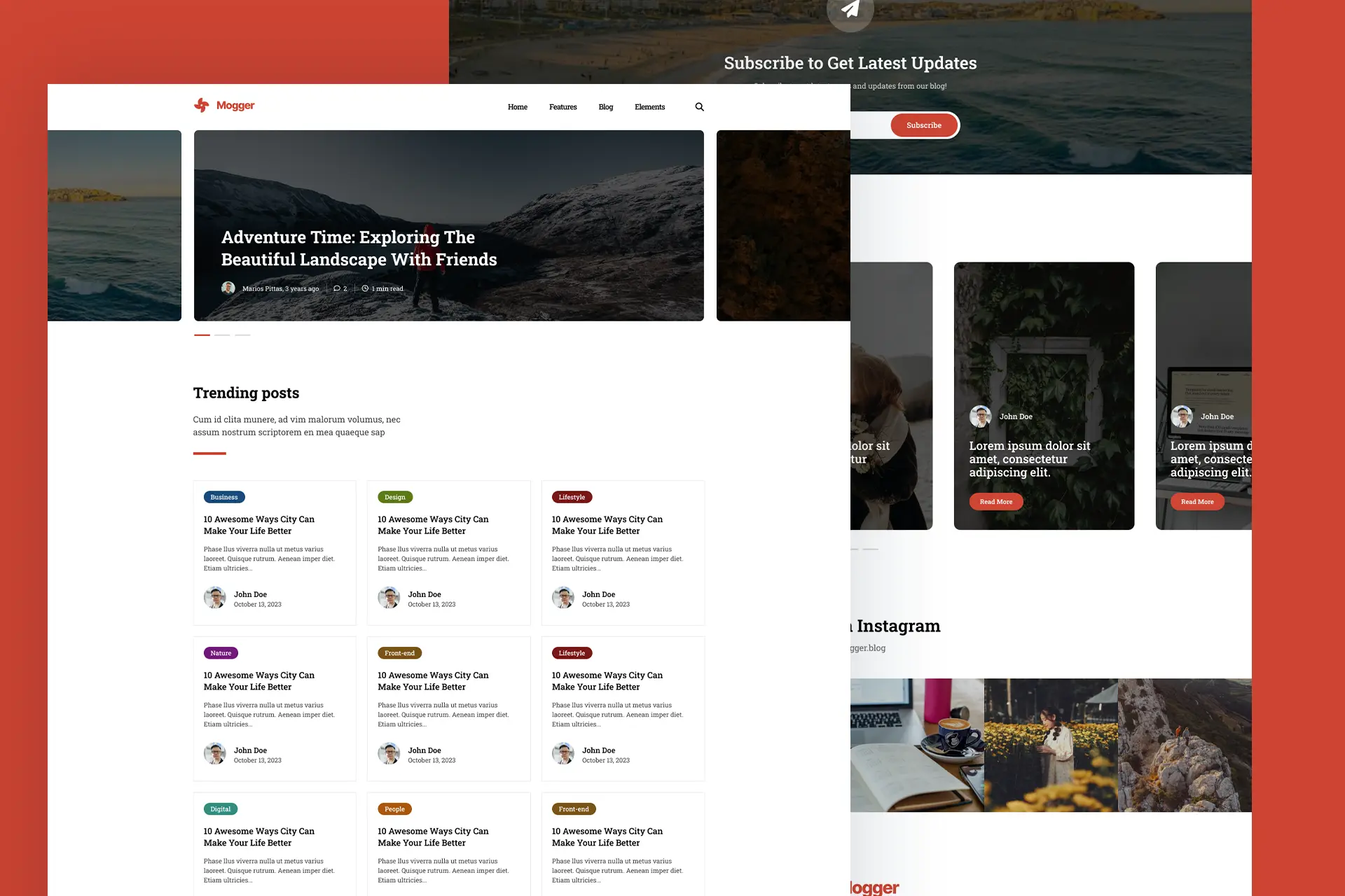
Mogger is an online blog platform, a dynamic space for writers to express themselves and share their thoughts with the world. The platform features a user-friendly interface with customizable themes, allowing bloggers to personalize their pages and create a unique brand identity. The interface also includes tools for easy content creation and management, as well […]
BizzBudd Website
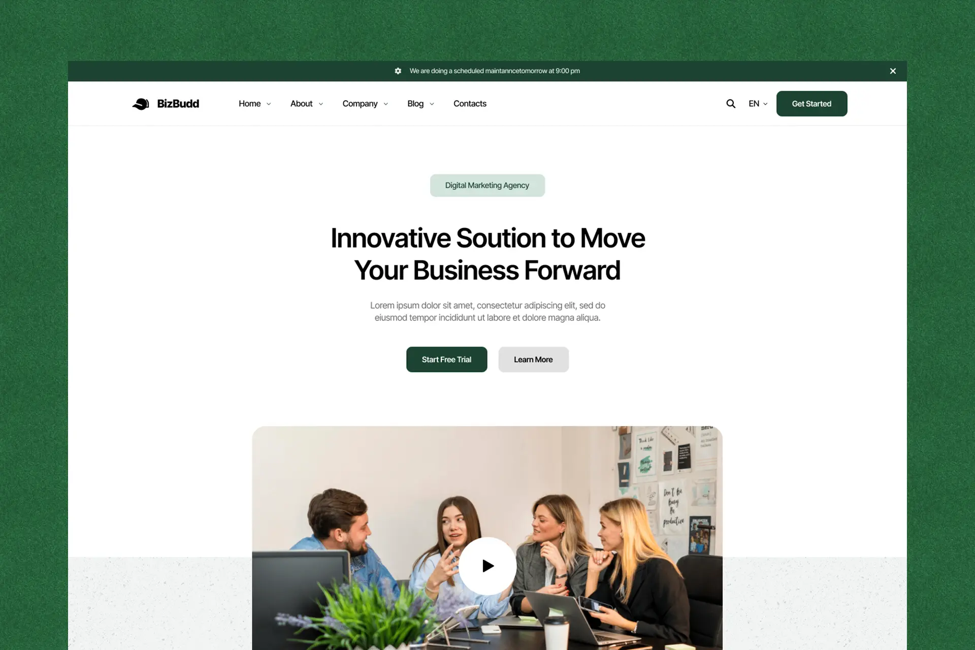
BizzBudd is a go-to resource for startups looking to accelerate their growth and achieve success. It offers a range of services to help startups overcome challenges, including funding assistance, mentorship, and access to networking opportunities. The platform also features valuable resources, such as educational content, industry insights, and expert advice, to empower startups and support […]
Portfolio Design
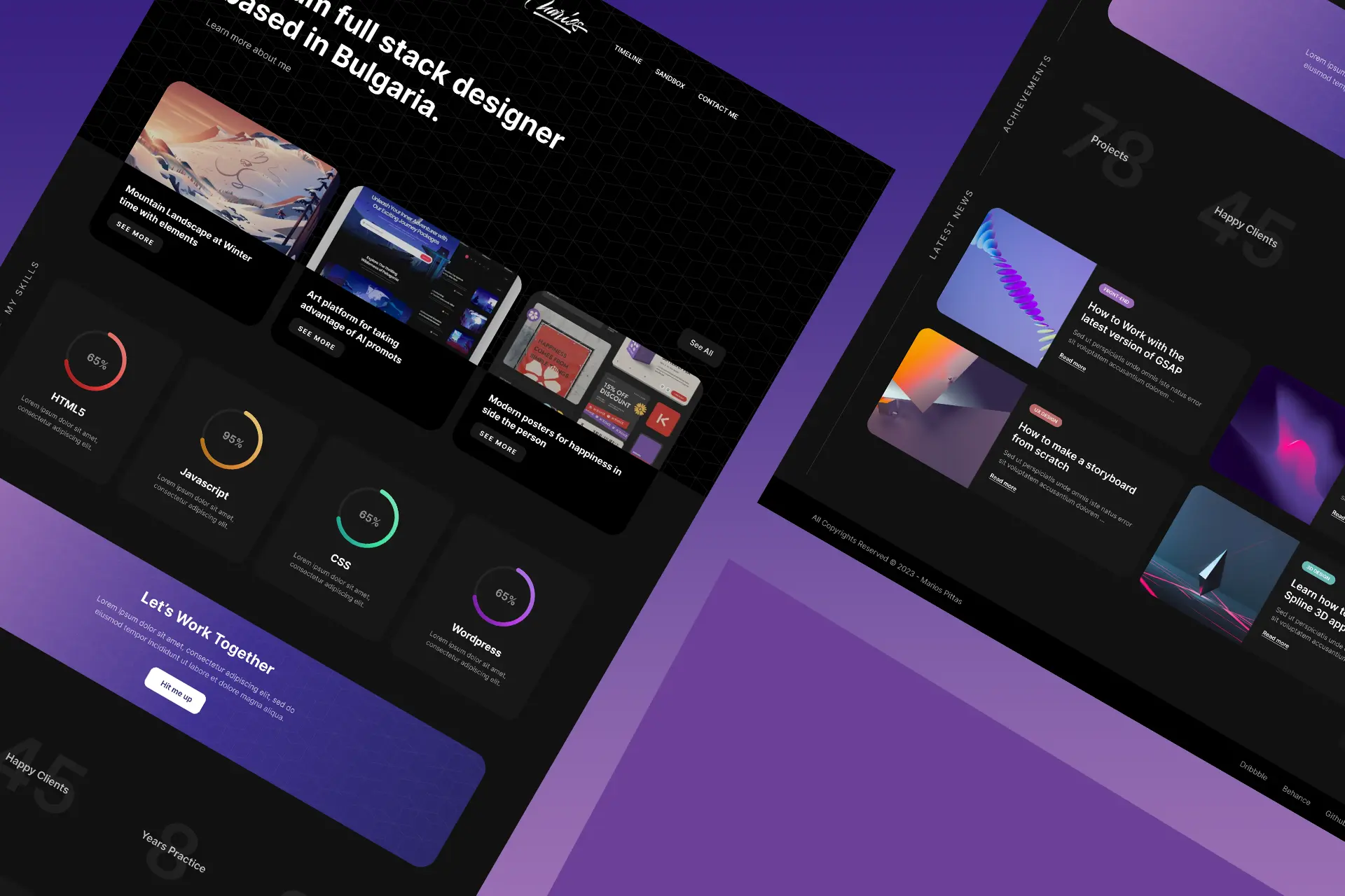
This is a web design for my website that has a clean and minimalist design, with a focus on showcasing my work. It include a simple color scheme, clear typography, and the use of images and videos to highlight projects. The layout is usually easy to navigate, with a prominent menu and clear calls-to-action for […]
PianoRepo Landing Page
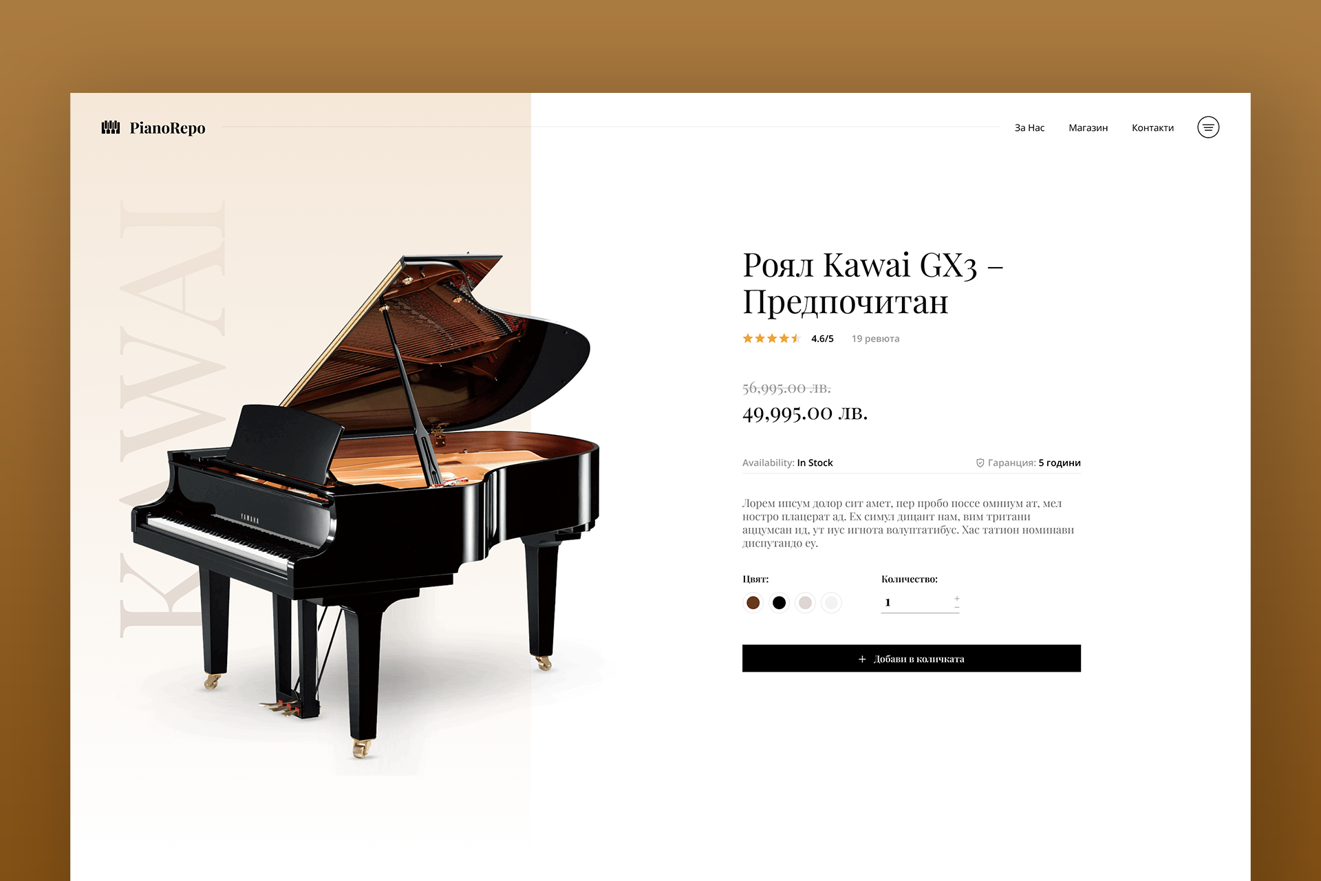
This online shop specializes in selling some of the world’s most renowned piano brands, offering a wide range of models to choose from. With a focus on quality and customer satisfaction, they provide detailed product descriptions and expert advice to help customers make informed purchasing decisions. Project file Home
Bonsai Farm
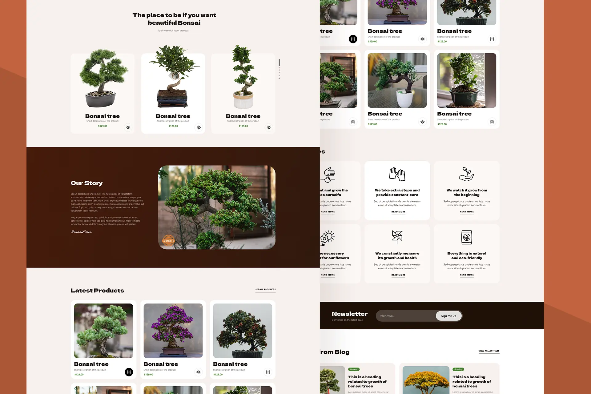
With using earth tones we can achieve a natural feel for the design of online e-commerce website that sells Bonsai trees. I stuck with applying different shades of brown and using opacity for some backgrounds. The typography is using Display font that is readable and easily recognizable. Project file Home page
Kanba
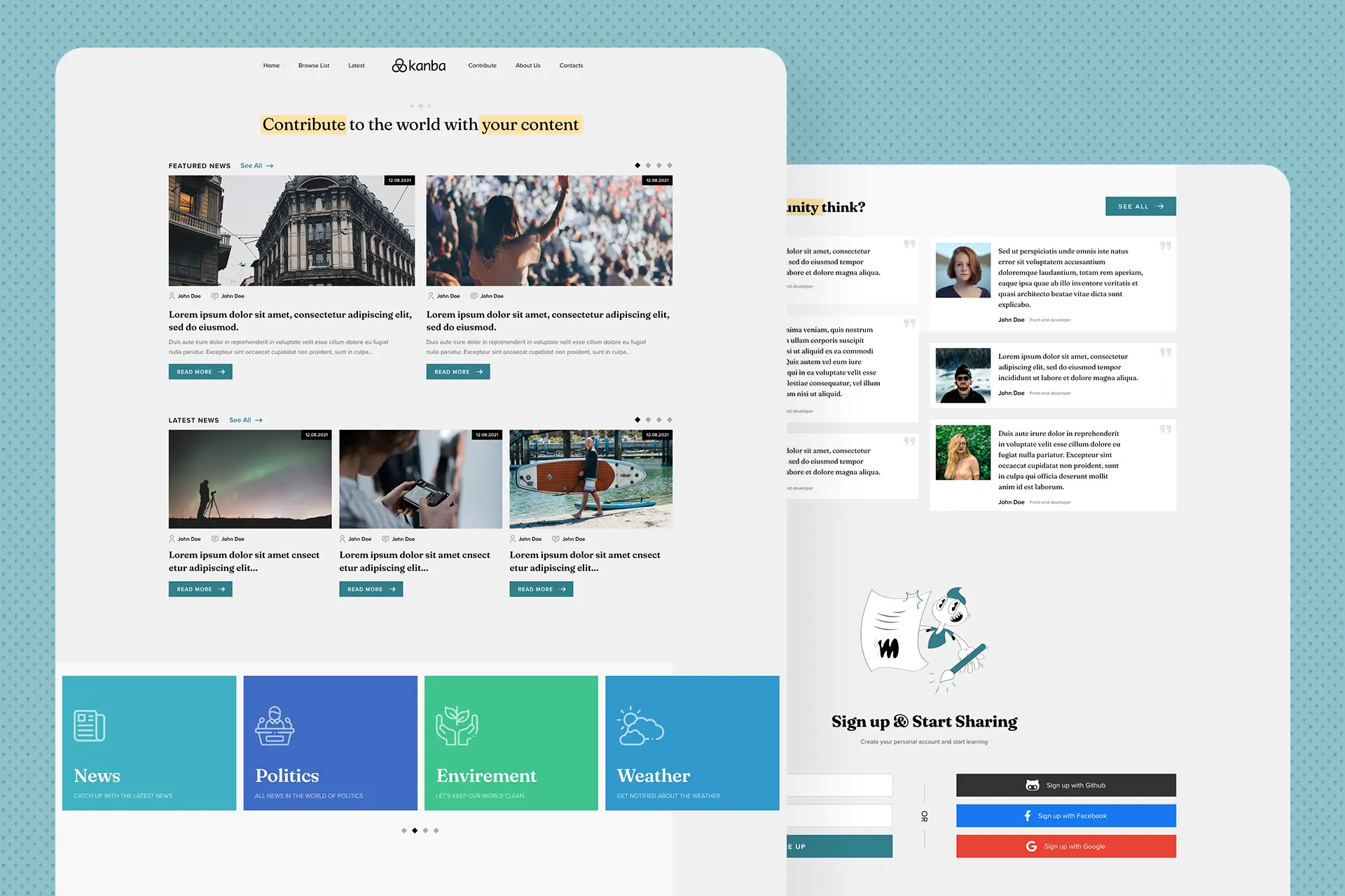
A news portal with a consistent design system that uses grey as the main background. For the accent we use a more tinted blue color that adds more variety to the website. With the use of illustrations we also give it a modern look. The typography is sans-serif to follow the standard convention for presenting […]
PowsRaiser
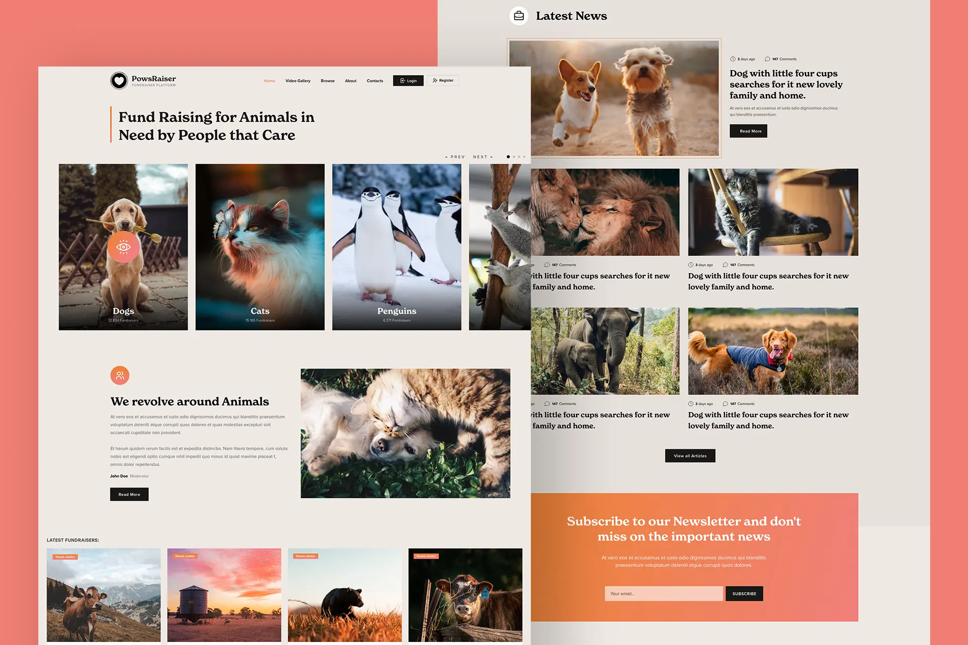
This is a project for fundraiser campaigns related to animals. A concept idea developed from my deep love to all animals. For the design I chose Ivory color since it gives a warm feeling and welcomeness. The accent color is Orange and it sticks out nicely. I chose a serif font because it pairs nicely […]